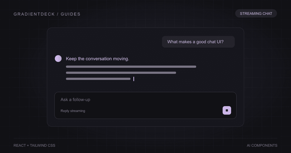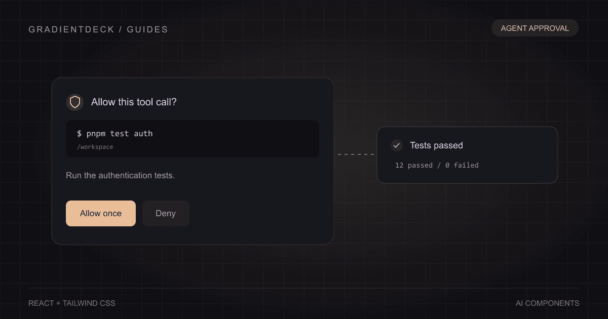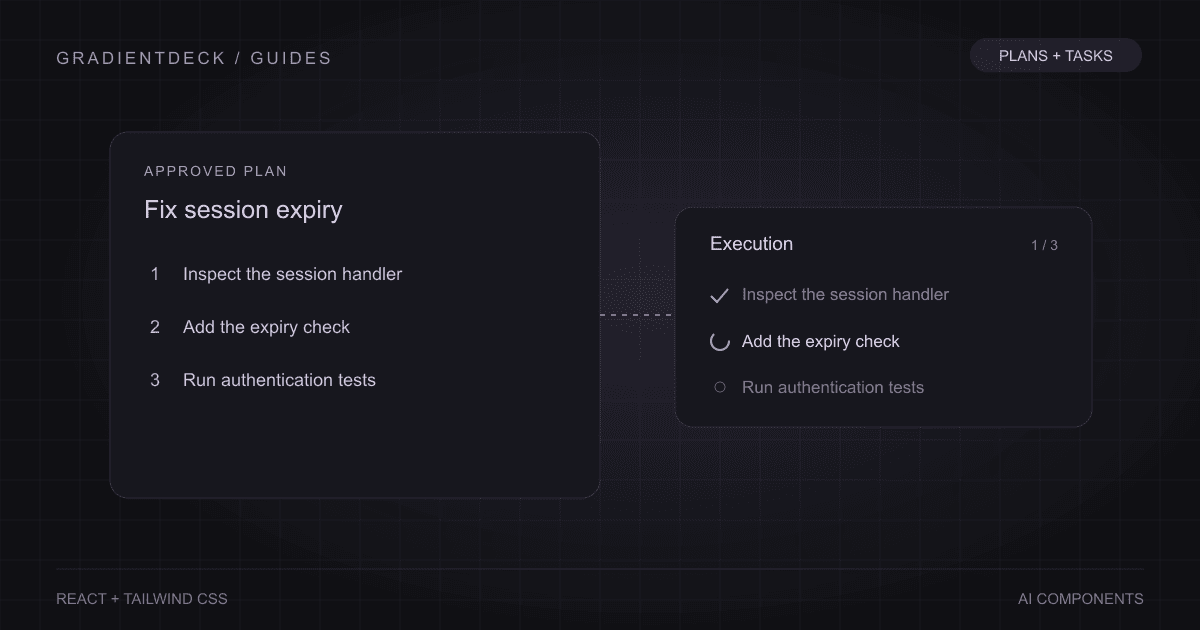
A component demo can own everything: sample messages, fake progress, a timer, a few buttons and the visual result. That is useful for exploring a layout. It becomes a problem when those same assumptions are buried inside the component that an application needs to reuse. A chat app already has a message store. An agent already has a run state. A voice session already has a connection lifecycle.
A reusable AI component needs a clear boundary. Decide which state belongs to the visual interaction, which state describes the application, and which state comes from a remote service. Then make that boundary visible in its props and callbacks.
Let the component own local presentation
An expandable output can own whether it is open. A source preview can own its popover position. A copy button can briefly show confirmation. These choices usually do not need to travel to the model or be restored from a database. Keeping them inside the component makes the application easier to connect.
Expose a controlled option when the application needs to coordinate that interaction. For example, a parent may need to open a particular panel after a search result is selected. Defaults are useful, but a hidden local state should not prevent an application from doing its job.
Keep shared application state in one place
If the composer, response area and history all depend on whether a request is active, they should agree on the same request. Three unrelated loading flags can produce a send button that is enabled while the response still says generating. React's guidance on sharing state recommends moving coordinated state to a common parent and passing values and handlers down.
type RequestState =
  | { status: "idle" }
  | { status: "streaming"; requestId: string; text: string }
  | { status: "done"; requestId: string; text: string }
  | { status: "failed"; requestId: string; message: string };

// The composer and response view read this same state.
// Each new event must belong to the active requestId.
The exact shape depends on the product. The useful property is that impossible combinations are harder to represent. When a late chunk arrives from an older request, the application can identify it rather than appending it to the newest answer.
Keep model and tool transport outside the visual
A prompt input should report a submission. It should not quietly choose your model endpoint, manage your secret key or decide how tool permissions work. A visualizer can accept a loudness level without opening a microphone. A result card can report an action without assuming that clicking it has successfully changed a remote object.
This separation makes the interface useful with different backends. It also makes failure states testable without waiting for a real model response. Supply a delayed result, an empty result or a rejected action and check what the person sees.
The voice interface guide and image-generation guide show parent-owned state driving visual components. Their sample timing is explicit; it is not presented as a model connection.
Callbacks are a contract
A button labelled Regenerate promises that another generation can start. If the application has not supplied a handler, decide whether to hide the action or disable it with a clear explanation. The visual should not silently imply a capability that does not exist. Likewise, onApprove reports a decision; it should not be confused with an execution result.
Keep that contract small and specific. onSelect(id), onStop() and onDecide(decision) are easier to connect than a single event callback carrying an undocumented object. Stable identifiers matter when the interface handles more than one message, result or tool call.
Keep the runnable example close
Clean component code and a runnable example serve different needs. The component explains the reusable API. The example demonstrates how to supply data, update progress, handle callbacks and clean up resources. A named export can be correct while a paste-in viewer still needs a default wrapper and meaningful props.
GradientDeck component files include named components and a default demo. The integration guides connect those named components in slightly larger examples. Read the demo as application wiring you can adapt, especially where a timer stands in for an external event.
Test the boundary, then the appearance
- Replace sample data with empty, long and partially available values.
- Trigger actions through callbacks and verify the resulting state.
- Cancel or unmount during a pending operation and check cleanup.
- Confirm that retries cannot attach an old result to a new request.
- Check keyboard navigation, reduced motion and a narrow container.
A reusable component earns its place when it can display the application's truth without maintaining a competing version of it. The styling is the part people notice first. The state boundary is what lets the component survive the move from a showcase into a real product.